Product design
How I solved the problems of the current minimalist phones
By understanding the pain points in the current line-up of minimalist phones, I studied and came up with a solution – the feather phone. Here is my case study on how it solves the problems persisting in the current gen devices.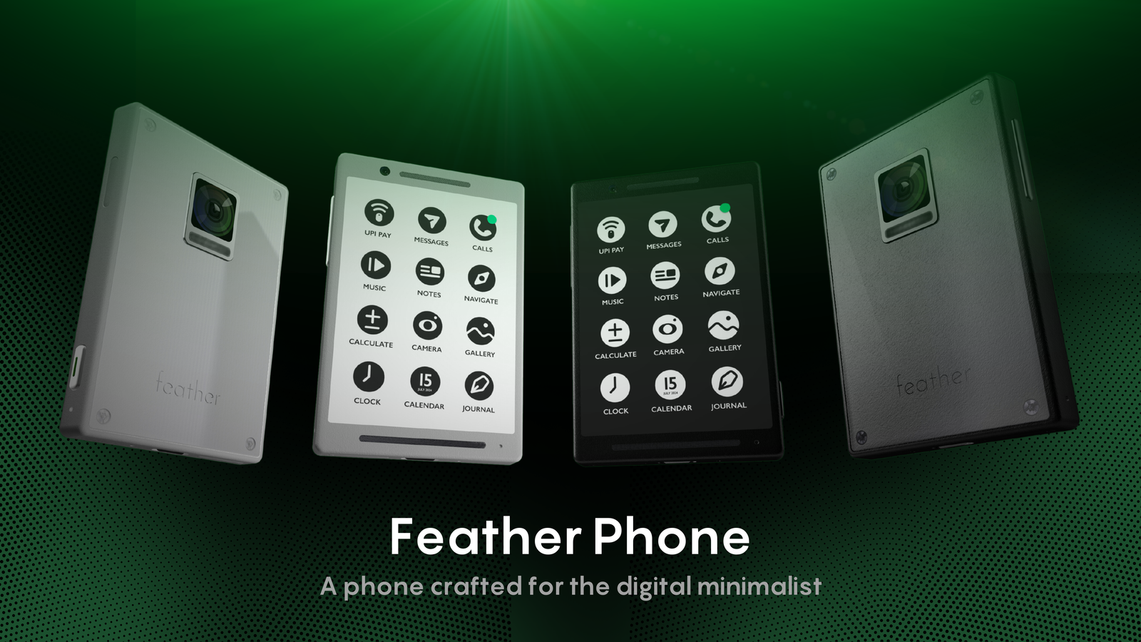
In today’s fast-paced digital world, smartphones have become indispensable tools. However, the constant influx of information, notifications, and distractions has led to a decline in mental well-being and productivity. I’ve felt the strain myself. I have tried various ways to declutter my digital life and become a digital minimalist.
This is where minimalist phones come into play, offering a simpler and more focused user experience. While existing options like the Light Phone, the Wise Phone and the Minimal Phone have made significant strides, they often compromise on essential features or lack a comprehensive design approach. I wanted a device that didn’t control me but worked for me. A phone that could be a tool, not a tether.
I studied the existing options and came up with a solution — the Feather Phone. I share more about the phone in this case study. The Feather Phone aims to bridge this gap by providing a minimalist device that doesn’t sacrifice functionality or user experience.
The Rise of Minimalist Phones
I’ve always been drawn to simplicity. It’s a philosophy I’ve tried to incorporate into various aspects of my life. So, when I started noticing a growing trend toward minimalist living, it resonated deeply. This movement extended naturally to our digital world, and I became increasingly intrigued by the idea of a minimalist phone.
Our smartphones, once novelties, have become extensions of ourselves. But this constant connection comes at a cost. The relentless stream of notifications, the addictive pull of social media, and the pressure to be constantly available have created a digital fatigue that many of us are experiencing. I believe we’re reaching a tipping point where people are craving a simpler, more intentional relationship with their technology.
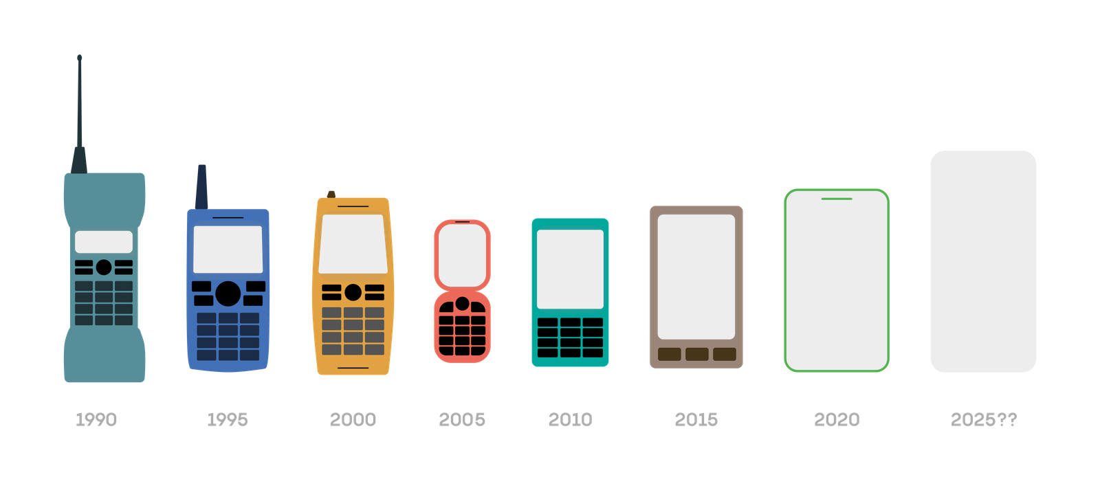
Minimalist phones offer a glimpse of this alternative lifestyle. They promise a digital detox without completely disconnecting us from the world. Yet, many of the current options feel like compromises. They either strip away too much or fail to deliver a truly satisfying user experience. It’s a gap in the market that I believe needs to be filled.
How Feather Phone Solves the Problems
Phones like the Light Phone stripped away too much, feeling like a step back in time. On the other hand, options like the Wise Phone and The Minimal Phone offered a more modern approach but often included too many features, defeating the purpose of minimalism.
The Feather Phone is a balance between these extremes. I designed it to provide a clean, intuitive experience without sacrificing essential functionalities. I wanted to create a phone that felt familiar to users coming from a traditional smartphone but offered a refreshing simplicity.
By carefully selecting core features and designing a modern, user-friendly interface, the Feather Phone addresses the limitations of its predecessors. It’s about providing a focused, efficient experience without compromising usability or practicality.
Competitive Benchmarking
When I looked at the market, three main players stood out: the Light Phone, the Minimal Phone and the Wise Phone. The Light Phone leaned too far into minimalism, sacrificing essential features for simplicity. It felt like a step back in time. On the other hand, the Minimal Phone overcompensated, offering a cluttered experience despite its minimalist aesthetic. The Wise Phone attempted a balance but stumbled with its pricing structure.
It was clear that none of these options fully captured the essence of a truly minimalist smartphone. I saw an opportunity to create a device that harmoniously blended simplicity with functionality. A phone that wouldn’t force users to compromise. The Feather phone could fill in these shoes.

The Feather Phone aims to differentiate itself by offering a more comprehensive feature set than the Light Phone 3 while maintaining the simplicity and focus of the Wise Phone. It will also incorporate a more modern and intuitive interface compared to the Minimal Phone.
By combining the strengths of these competitors and addressing their shortcomings, the Feather Phone seeks to establish itself as the optimal choice for users desiring a minimalist yet functional smartphone.
User-Centric Design Approach
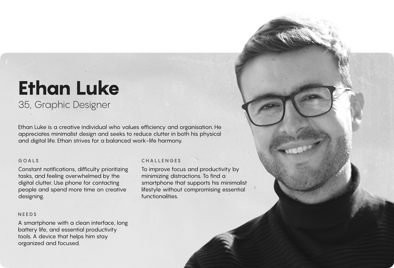
From the start, I knew the Feather Phone couldn’t be just a design exercise. It had to be a response to real people’s needs. I spent countless hours analyzing potential users, talking about this idea to my friends, understanding their frustrations with current smartphones, and learning what they truly value in a phone.
Creating user personas helped me visualize my target audience. I wanted to design for real people, not abstract concepts.

Hardware Design and Rationale
I designed the Feather Phone’s hardware to complement its minimalist software by offering a tangible, tactile experience that prioritizes functionality and user comfort. My goal was to create a device that feels substantial yet refined, capable of delivering high-quality performance without unnecessary bulk.
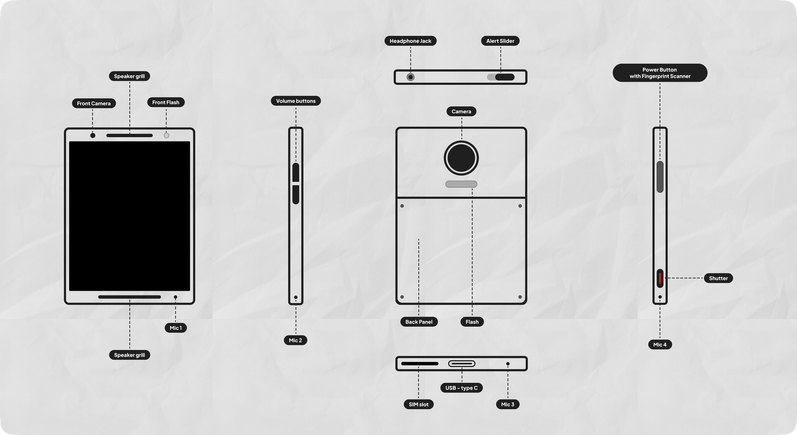
- Alert Slider: Inspired by Apple’s innovative approach, I included an alert slider to give users complete control over their notifications. Unlike Apple, the users can mute, vibrate, or make the notifications loud with a 3-step slider. Yes, even though the notifications are minimal, I felt this option was necessary. It’s a small feature with a big impact on user experience.
- Volume Buttons: While simple, volume buttons are essential for any phone. I opted for a traditional design to avoid unnecessary complexity.
- AMOLED screen: Instead of e-ink displays that most minimalist phones adopt, I designed the phone to have an AMOLED display with a black and white colour theme. The camera and the gallery get to use the complete colour spectrum of the display.
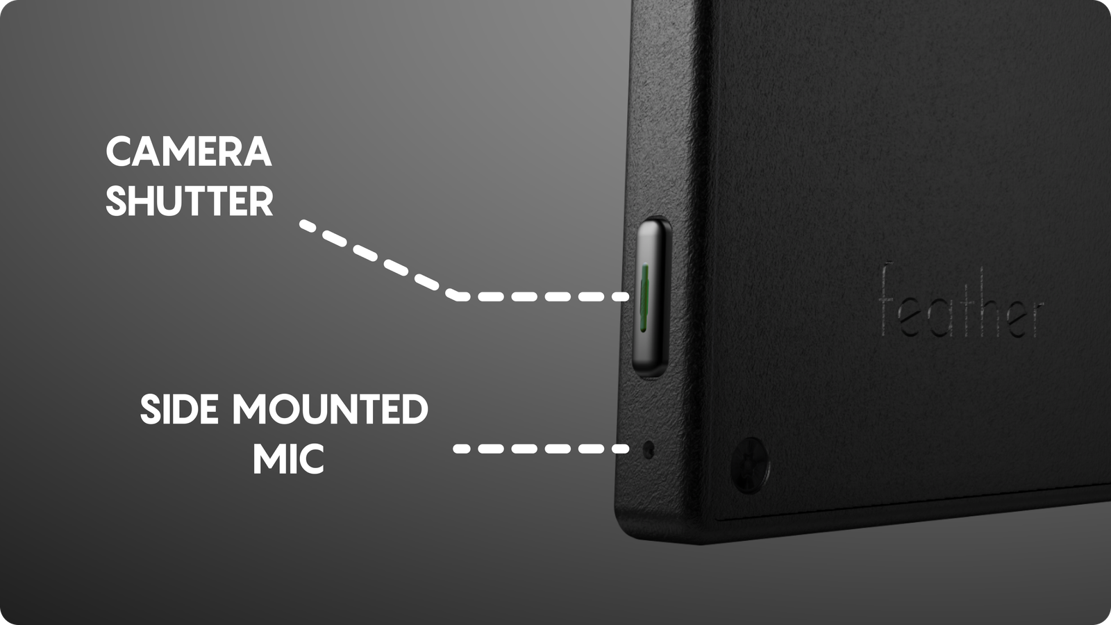
Physical Shutter Button: I wanted to bring back the tactile experience of traditional photography. A physical shutter button offers a satisfying and intuitive way to capture moments. I had used a Sony Xperia phone before and I always enjoyed clicking photos through the shutter button. The ‘half-press’ to focus and the ‘full-press’ to click the shutter button is something I wish to see on all phones.
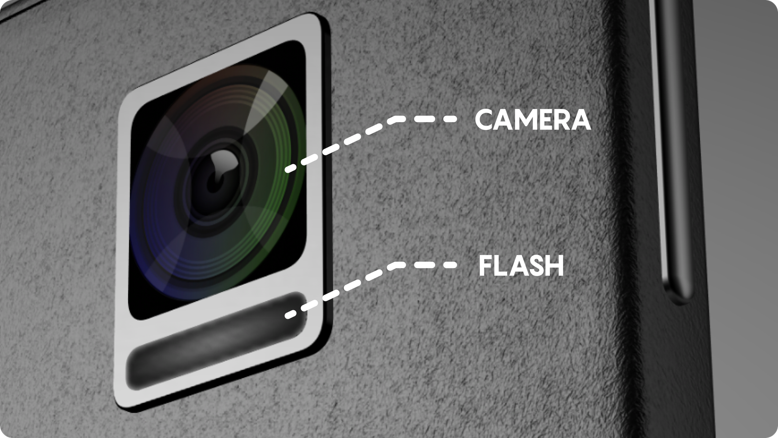
50MP Camera with OIS and EIS: A high-quality camera is a must in today’s phone landscape. Optical and electronic image stabilization ensure top-notch photo and video quality. To compensate for the presence of an ultra-wide camera, a 2-way panorama mode is provided. Now ultra max wide angle is possible. Also, to compensate for the zoom lens, the 50 MP main shooter can optically zoom in up to 2.5x.

Gold-Plated 3.5mm Jack: Despite the wireless trend, I included a headphone jack for those who prefer wired audio. Call it nostalgic or practical, this is a phone for the audiophile.
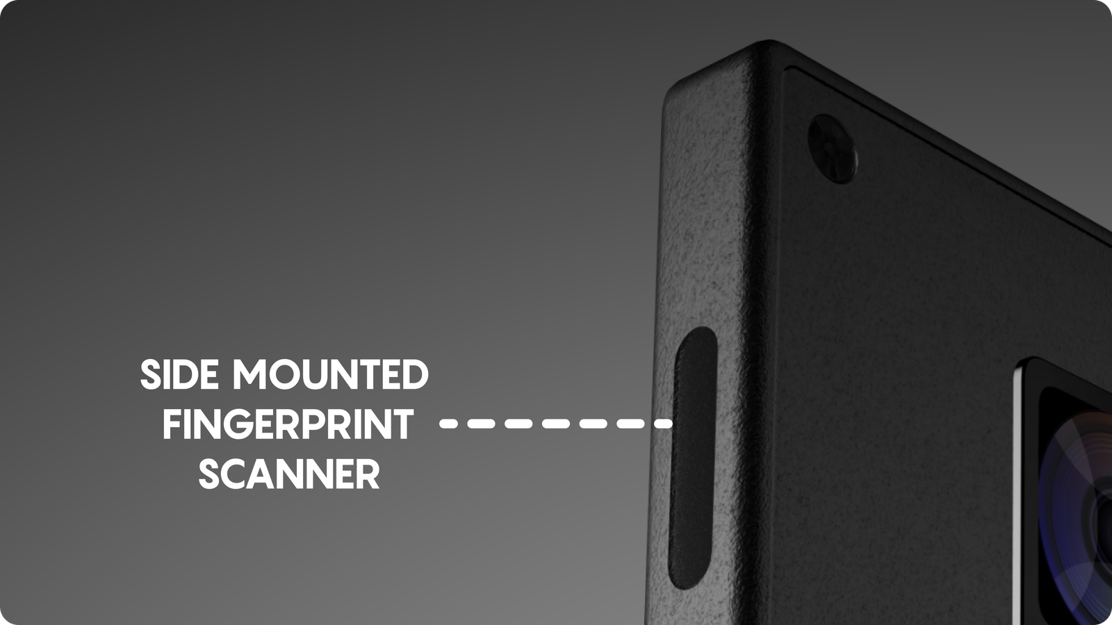
Fingerprint-Enabled Side Lock: For security and convenience, a side-mounted fingerprint sensor seemed like the perfect solution. It’s accessible and efficient.

USB-Type C Port: As a universal standard, USB-C was the obvious choice for charging and data transfer. Fast charging is now possible.
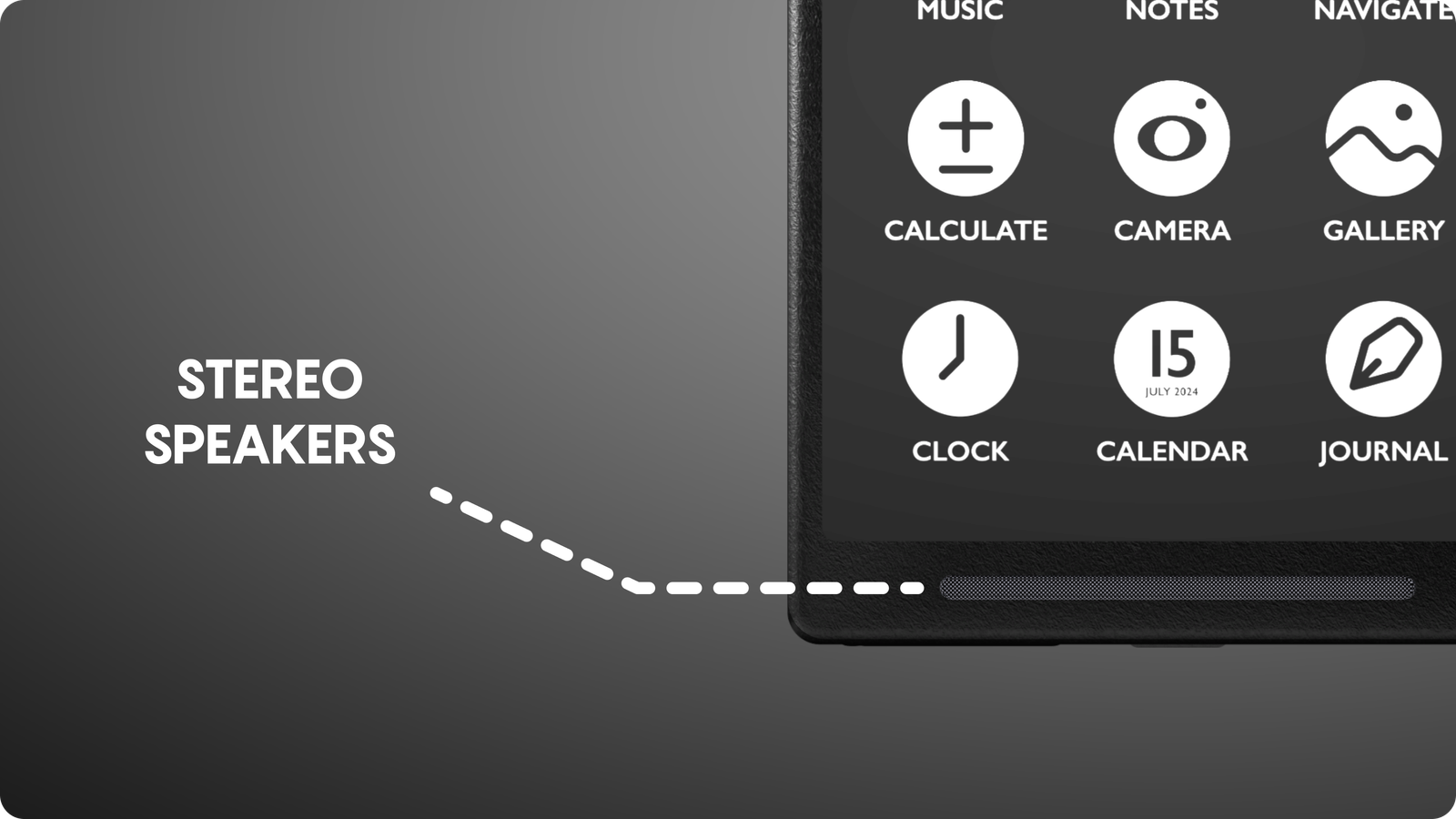
Dual Stereo Front-Firing Speakers: To deliver an immersive audio experience, dual front-facing speakers were essential. No down-firing gimmicks here. Two powerful speakers pair up to provide a stunning audio experience.
Powerful Flash and Torch Functionality: Combining a powerful flash with a torch functionality is a practical and efficient use of hardware. When used as a torch an additional powerful LED brightens up the whole scene.
Software Design and User Experience
- Monochromatic Colour Palette: I wanted the Feather Phone’s software to be as clean and focused as its hardware. A black-and-white palette was the obvious choice. It’s simple, elegant, and easy on the eyes. It creates a clean, minimalist aesthetic. As mentioned above, the only splashes of colour come from photos and videos, making them pop.
- Custom Iconography: Consistent, custom icons enhance visual harmony and brand identity. Everything from the phone app to the settings icon has the same minimalist style.
- All Caps Text: All caps system text provides a unique, modern look while maintaining readability and uniformity.
- Dark and Light Mode: Offering both options ensures user preference is accommodated and reduces eye strain.
- Main Menu and sub-menus: For navigation, I kept things simple. The main menu uses just text labels for a clean look. But for the submenus, I added icons to help users quickly identify options. It’s a balance of minimalism and usability.
I wanted the Feather Phone to be easy on the eyes and a joy to use. Every design choice was made with that in mind.
Future Plans
The Feather Phone is just the beginning. I envision expanding the ecosystem with essential apps that align with the minimalist philosophy.
A payment app, for instance, would need to be sleek and secure, focusing on essential transactions. A calculator app should be simple, efficient, and free from distractions. A journal app could be a digital sanctuary for thoughts and ideas.
I plan to continuously gather user feedback — first from my friends, and then from the external world and iterate on the Feather Phone’s design. User testing will be essential in ensuring the device meets the needs of its users and continues to evolve. Watching people interact with the Feather Phone prototypes will be invaluable. Seeing where they struggle, where they smile, and where they get confused will help me refine the design.
I believe the Feather Phone has the potential to redefine the smartphone experience. It’s more than just a device; it’s a statement about how we want to interact with technology. By prioritizing simplicity, functionality, and user well-being, I’ve created a device that offers a refreshing alternative to the cluttered and overwhelming smartphones that dominate the market.